The idea for what became Woodhead started from the combination of two puzzles in Professor Layton & the Unwound Future. If you like puzzles at all, you owe it to yourself to pick up any (or all) titles from this series.
The first puzzle I wanted to draw from and expand upon was a square maze. In this maze were multiple blocks, which you controlled by rotating the maze by 90 degree increments, and the blocks would fall based on the current gravity. My first thoughts were that the iPhone would make a great device to play more of this kind of puzzle on. Using the accelerometer, it would have physical feedback to what was occurring onscreen.

Gravity Maze puzzle from Professor Layton & the Unwound Future. Arrow buttons rotated the in-screen maze by 90 degree increments.
The second puzzle which had some great potential was the toy car bonus game in your suitcase. This puzzle was one of my favorites. It works like this: you see the map, your car is at a designated start point, and there is a goal to get to. Your car moves forward until it hits a wall (you lose) or a special tile which changes the car’s movement. You have a limited number of special tiles to place, each one affects your cars movement in a particular way.

Still image from the Toy Car mini game in Professor Layton & the Unwound Future. Copyright Nintendo. You should buy it.
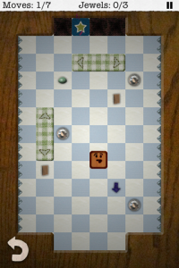
So, I mocked up my idea of combining the two. The thing I wanted to specifically change was that I wanted the tile placement to be more fluid. Instead of placing all tiles before movement, I wanted tiles to be collected, more like “power-ups” in traditional games, and then placed once collected. This would keep gameplay moving and engaging during play. I experimented with stockpiling tiles to be placed when needed, but i felt that forcing placement, at the time of collecting them, simplified the decision process of what to do with the tiles.

The only image I could find. Includes original pixel art, showing the screen when waiting for a tile to be placed. Notice Woodhead is not wood, just a purple square.
The result worked pretty well, except the control scheme. Rotating the device was very disorienting, especially when placing tiles changed the board layout that you had memorized. So, swipe to move replaced the (somewhat gimmicky) rotate gravity concept. Rotate to move was added back in later, but only on the bonus levels you can unlock. The novelty is much less abrasive when it is only there for short periods of time.
Another game I really liked is Cross Fingers, which had a really fun way of making use of the touch screen, so you will also see a bit of that in Woodhead starting on Page 4.
Due Diligence
It seemed to me, the idea must have been done before, so I did some searching in the app store. I did find one very similar app: Blocks Mania. It was a similar game in looks (pixel art) and control (swipe to move, don’t stop until wall). The differences from Woodhead are that, in Blocks Mania, the view is very zoomed out, and while there are power-ups, they are not using any touch control in their effects. The fact that Blocks Mania was also pixel art did make me change the graphic style, which I think was a change for the better.
Here is video of the final gameplay.


