Write Fight: Ludum Dare 32

Jam Theme: Unconventional Weapon

Before going into the jam, I knew that I was going to use Pico-8 to create my game. It allows for quick game creation by handling all the code, art and sound within a very small and tight package. The limits of the fantasy console helped keep the scope of the project small and within reason for a short weekend.

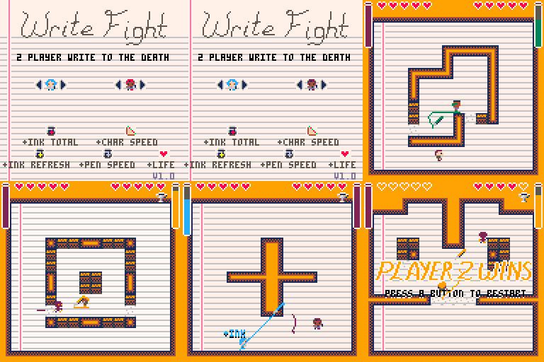
The idea of Write Fight was to be a fighting game, but instead of punches and special moves, a controllable line would be drawn to deal the damage. I pictured it as a side scrolling platform, akin to Smash Bros, but once I started to build the characters and draw mechanic, it became clear that side-scrolling wasn’t suited well to this method of attack. Instead I chose to go with an overhead view, like Zelda: Four Swords or Bomberman, and I think it was the better choice. It makes more sense to be standing still than allow falling while drawing.

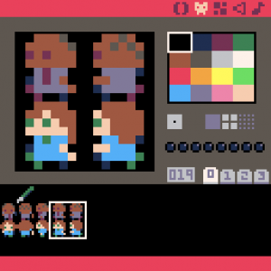
First characters and pen sprite in Pico-8 Editor.

First characters and pen sprite in Pico-8 Editor.

The game was made rather quickly, on Friday night/Saturday morning I created the code for drawing lines. On Saturday afternoon, I was in a tournament for Magic: The Gathering, so I spent time in between rounds drawing characters and the tilemap walls. The rest of the weekend, I had to juggle my time between caring for my 1 1/2 year old son and not completely ignoring my wife. The game came together late Sunday when the power-ups were added and a game end was included. The lined paper floor was created just a few hours before the turn in time of the jam, as all the previous floor patterns I tried were too busy, too dark or duplicated colors I wanted to use for characters (Pico-8 has a palette of 16).

Play the jam version here

While making the game, I really didn’t have a chance to play with another person until Sunday night, so most of the design decisions were theoretical. My wife played many matches with me (after I submitted), and the game turned out very fun. The power-ups were very important to keeping the gameplay moving, as being too greedy with collecting usually turned into game loses. Strategies emerged from our gameplay as well. The lines you draw will continue to do damage if walked into, so barrier lines crossing wanted paths or in the way of power-ups became a common tactic to trip up or slow each other down. Making sweeping lines around the opponent also forced them to stand still and wait for the lines to clear up before moving again.

After the jam, I could not stop thinking about the game, so I continued working on it at night during the week. The power-ups I had planned, but didn’t get to during the jam were added (sandwich and heart). Also: a title screen, multiple characters, selectable colors, best-of-three matches (which is adjustable in code), multiple maps to randomly choose, and breakable blocks to give the drawing mechanic more utility.

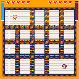
Bomberman inspired level.

Bomberman inspired level.

I’m quite proud of the final version, it does everything I wanted the game to do and turned out more fun than expected. To test the final version, I took my laptop and controllers to Friday Night Magic (the week after the jam) and invited players to try the game in between matches. It was well received, as the noise level of the players disturbed people still playing cards at the nearby tables.

release_anim_2x

Post-jam, Version 1.0

Play the final version (1.0) here
 

Clipping FTilemaps

Tilemaps in games help save resources by reusing a limited number of tiles, often just to the edge of visibility on screen. My first creation of the FTilemap class didn’t include this important functionality, but I’ve corrected that now.

You can still render the entire FTilemap by making skipZero = TRUE, and in some cases that may actually save overhead. FTmxMap will now check for skipZero layer property, and set the FTilemap appropriately (it is FALSE by default). Be sure to pass a clipNode to determine where the centerpoint is (usually this will be your FCamObject).

// create camObject
FCamObject cam = new FCamObject();

// create map, clip to the screen
FTilemap map = new FTilemap("YourImage");
map.clipNode = cam;
map.clipToScreen = true;
map.LoadCSV("CSVs/MapFile");

Additional Futile classes on Github.

Adding iCade to Unity

iCade and iCade 8-bitty are bluetooth game controllers that passes keyboard button presses to your portable device. They make great controllers for touch-screen only devices and even for playing on a laptop.

One of the things I’ve been looking everywhere for is an easy way to include an iCade controller in my Unity projects. The only one I could find is the plugin from Prime31 for $35. It seemed odd to me that there is a free SDK to make iCade work with native Xcode projects, but no free Unity integration. So I decided to write it and share it.

Download the scripts from Github. The following videos explain how to test for iCade button presses, and make your iOS device send the button presses to your Unity game.

Video part 1 covers adding the scripting to your project to detect for button presses.

Video part 2 covers setting up Xcode to sync the button presses.

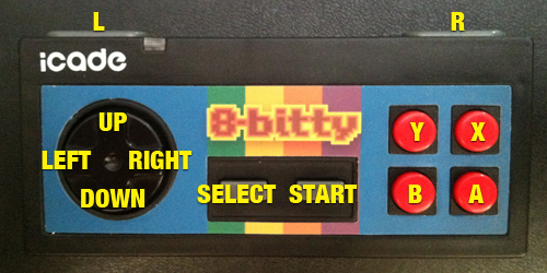
Below is an image showing the names to use in your scripts for each button.

Button layout for iCade 8-bitty.

Button layout for iCade 8-bitty.

// Examples

// isDown returns true if the button is down this frame
if (ICade.instance.isDown("UP")) {
Debug.Log("UP button is held down.");
}

// justPressed returns true only on the single frame when the button was pressed
if (ICade.instance.justPressed("Y")) {
Debug.Log("Y button pressed.");
}

// justReleased returns true only on the single frame when the button was let go
if (ICade.instance.justReleased("Y")) {
Debug.Log("Y button released.");
}

I haven’t used the Prime31 plugin, so it may work better than my way.

FParallaxContainer

FParallaxContainer is a new class I added to the FutileAdditionalClasses repo at GitHub. The class is for adding layers to your Futile game that move at a different speed than the camera. You can use this class to create the illusion of depth with slower layers in the background, and faster layers in the foreground. The class extends FContainer, so you can add any FNode content you like to it.

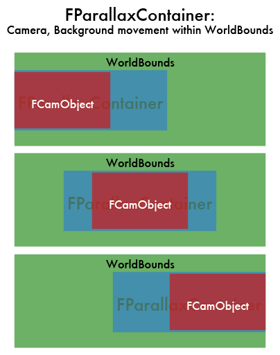
Fill the container with objects, most likely an FTilemap, then set the size. If the FParallaxContainer size is less than the screen size, it will always position itself centered with the FCamObject. When the size is larger than the screen, but less than the cam’s worldBounds, it moves slower than the camera. The example below shows this, with the camera in red, FParallaxContainer in blue, and the worldBounds in green. Notice how the left side matches up when the camera has hit the left side of the worldBounds, and the right side matches up when the camera has reached the right.

FParallaxContainer Example

You can also use FParallaxContainer to create a foreground layer, moving faster than the camera if the size is set larger than the camera’s worldBounds.

You can also limit the movement to just one axis by making the x (width) or y (height) smaller than or equal to the screen size. Objects within the FParallaxContainer can be placed outside of the size you set.

Example code:

FCamObject _camObject = new FCamObject();
_camObject.setWorldBounds(new Rect(0,0,Futile.screen.width*3,Futile.screen.height*2));

FParallaxContainer starfield = new FParallaxContainer();
starfield.camObject = _camObject;
starfield.size = new Vector2(Futile.screen.width*1.1f, Futile.screen.height); // this is only going to move slowly left/right, not up/down
AddChild(starfield);
/* add some stars to the starfield, via starfield.AddChild(FNode);*/

/* add the camera last, so it appears above all other objects */
AddChild(_camObject);

Sifteo Prototype

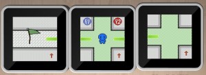
At this year’s PegJam, I decided it was the perfect time to put together my idea for the Experimental Gameplay Project Sifteo Cubes Competition. I’m partial to dungeon crawlers, so my first idea was to make a random map, which you can move about by connecting cubes to see adjacent screens and then moving your character between them. I also wanted to keep it very simple, so it could be completed during the weekend. So, the game became a multiplayer “Capture the Flag” game. Unfortunately due to time, I didn’t get to the random map generation part. But overall, it turned out pretty good.

Prototype Screens

Prototype Screens

Each player takes a turn where they can move 5 screens, trying to be the first to visit all three flag checkpoints. The first to do so wins. Simple enough. Players begin in a random spot in the map, each flag is also placed randomly. Each quadrant of the map has its own color floor, with a strip of white floor separating the four quadrants (it’s a 7×7 map). While playing, the other players should be paying attention to the others movement and placement to figure out where all of the flags are. When a player has used up all of their moves, a notice pops up for players to switch, and the screen focuses on the next player when all cubes have disconnected.

Taking this idea forward, I want to give the game more of a board game feel. So here’s a bulleted list of what I would add:

  • 2-4 players
  • Menu/options
  • Orientation not matter
  • Graphics/Animation!
  • Randomly generated maps
  • Shake to roll dice for # of screen moves this turn
  • 1 time bonuses found in map, (i.e. extra moves, limit other players to two screen view limit for a turn)
  • Mini-map of where you’ve been on disconnected screen(s) — if it doesn’t make it too easy
  • Pac-man style wrap-around tunnels
  • Other gameplay modes (Hide & Seek)

Download the prototype: https://www.dropbox.com/s/4h5maujsuts8qc1/MazePrototype.elf

Woodhead Gameplay and Inspiration

The idea for what became Woodhead started from the combination of two puzzles in Professor Layton & the Unwound Future. If you like puzzles at all, you owe it to yourself to pick up any (or all) titles from this series.

The first puzzle I wanted to draw from and expand upon was a square maze. In this maze were multiple blocks, which you controlled by rotating the maze by 90 degree increments, and the blocks would fall based on the current gravity. My first thoughts were that the iPhone would make a great device to play more of this kind of puzzle on. Using the accelerometer, it would have physical feedback to what was occurring onscreen.

Gravity Maze puzzle screenshot.

Gravity Maze puzzle from Professor Layton & the Unwound Future. Arrow buttons rotated the in-screen maze by 90 degree increments.

The second puzzle which had some great potential was the toy car bonus game in your suitcase. This puzzle was one of my favorites. It works like this: you see the map, your car is at a designated start point, and there is a goal to get to. Your car moves forward until it hits a wall (you lose) or a special tile which changes the car’s movement. You have a limited number of special tiles to place, each one affects your cars movement in a particular way.

Still from Professor Layton & the Unwound Future

Still image from the Toy Car mini game in Professor Layton & the Unwound Future. Copyright Nintendo. You should buy it.

So, I mocked up my idea of combining the two. The thing I wanted to specifically change was that I wanted the tile placement to be more fluid. Instead of placing all tiles before movement, I wanted tiles to be collected, more like “power-ups” in traditional games, and then placed once collected. This would keep gameplay moving and engaging during play. I experimented with stockpiling tiles to be placed when needed, but i felt that forcing placement, at the time of collecting them, simplified the decision process of what to do with the tiles.

Early Woodhead screenshot

The only image I could find. Includes original pixel art, showing the screen when waiting for a tile to be placed. Notice Woodhead is not wood, just a purple square.

The result worked pretty well, except the control scheme. Rotating the device was very disorienting, especially when placing tiles changed the board layout that you had memorized. So, swipe to move replaced the (somewhat gimmicky) rotate gravity concept. Rotate to move was added back in later, but only on the bonus levels you can unlock. The novelty is much less abrasive when it is only there for short periods of time.

Another game I really liked is Cross Fingers, which had a really fun way of making use of the touch screen, so you will also see a bit of that in Woodhead starting on Page 4.
Due Diligence
It seemed to me, the idea must have been done before, so I did some searching in the app store. I did find one very similar app: Blocks Mania. It was a similar game in looks (pixel art) and control (swipe to move, don’t stop until wall). The differences from Woodhead are that, in Blocks Mania, the view is very zoomed out, and while there are power-ups, they are not using any touch control in their effects. The fact that Blocks Mania was also pixel art did make me change the graphic style, which I think was a change for the better.

Here is video of the final gameplay.

Woodhead Site
Woodhead in App Store

Introducing Woodhead

Woodhead

This is Woodhead

Woodhead is a challenging puzzle game created by Terrance Kritmen (writer & music) and myself (design & programming). It is available for iPhone/iPod Touch from the iTunes App Store ($1.99).

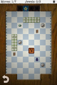
Woodhead Level 4H

A level from Woodhead

The above picture shows one of the levels in the game. The gameplay goes: swipe to move, try to collect all the jewels and reach the exit within the given number of moves. Doesn’t sound too groundbreaking, does it? Well, here’s how I tried to shake that up a bit.

One thing that (almost) always bothers me about touch screen games: onscreen controls, virtual buttons. So, with Woodhead the only on-screen buttons are the quick reset and the pause button. Movement is mapped to swipes, that’s an easy start to touch interaction. How else could I take advantage of the touch screen? To start with, if you look at the screenshot, there are three items that don’t look like jewels (when you see them in the game, they’re always moving). When Woodhead touches those items, the game pauses and allows you to touch the screen to place a tile onto the game board. This allows you, the player, to add items to the game board. Each different item lets you place a different type of tile: cardboard makes a solid block, arrows change Woodhead’s direction, green slime makes a larger goo spot that Woodhead sticks to instead of sliding past. You will need to plan ahead to future moves, trying to create the quickest path for you to reach the goals.

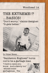
The Extreme!? ...Basics!

Woodhead makes the news.

How else does this game differentiate itself? Writing. Which is pretty damn funny thanks to Terrance Kritmen.  Each level starts with a newspaper page, giving the level name, (sometimes) a hint, and an “In Other News…” article. Woodhead, being the title character and a bit of a narcissist, is inserted into the photos. In between worlds (or Pages as I like to call them), Woodhead answers questions at press conferences, giving the game some story and humor.

Here is the video trailer for Woodhead, which should give you a good idea of the humor in the game:

– Matt
PS Be sure to have your speakers or headphones on for the end credits in the game…

Woodhead on iTunes

Woodhead webpage